User Interface
TouchDRO's user interface consists of three different activities (screens):
- Main Activity - displays axis readouts in a traditional numeric format
- Graphical Display - displays a 2D graphical representation of the current workspace
- Application Settings - used to configure TouchDRO
Common Elements
The three TouchDRO screens share a few common elements that stay more or less unchanged.
Action Bar

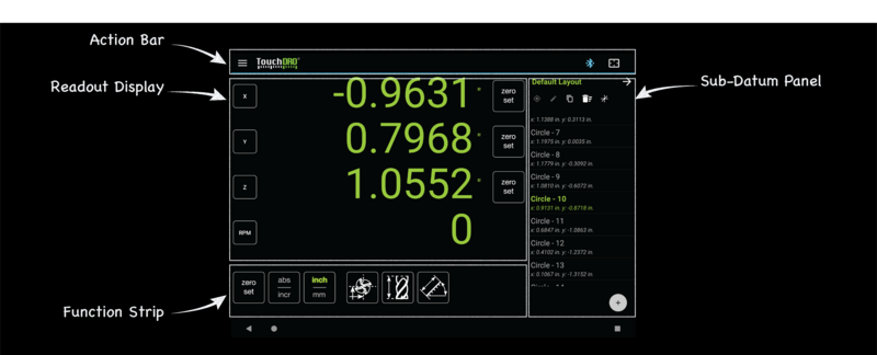
The action bar is a narrow strip at the top of the screen that stays constant between various TouchDRO activities. It includes the following UI elements:
- Application "hamburger" menu
- TouchDRO logo
- Connection toggle button
- Graphical View toggle button
Application Menu Drawer
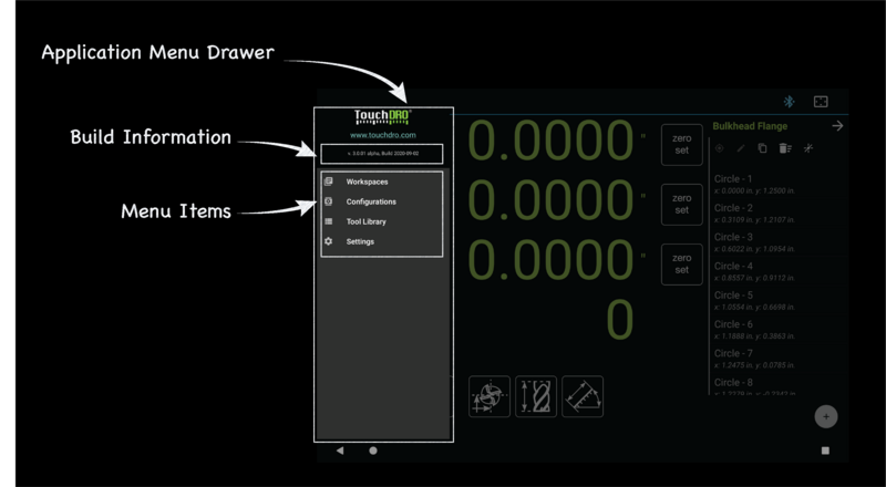
The menu drawer is hidden by default and can be displayed by either pressing the Application Menu button or swiping from the right edge of the screen. It contains:
- TouchDRO build information
- Application menu items
Main Activity
When TouchDRO starts, it displays the Main Activity, which is designed to resemble a traditional digital readout display.
Numeric Readout Display
The numeric readout display takes up most of the screen space and consists of one or more axis position readouts as configured in the Application Settings. This includes up to three linear axis displays for X, Y, and Z axes, Angular axis display, and RPM display.
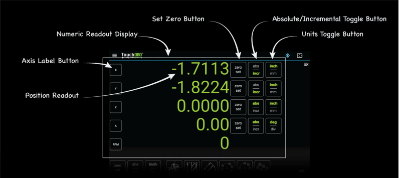
- The display can be fully expanded when the Saved Sub-Datums panel is collapsed, or vice versa. In the expanded state, each axis (with the exception of the RPM) display includes:
- The Axis label button, used to bring up the details dialog for the axis
- The Axis position readout
- The "Zero Set" button, used to set the axis to "0"
- The "Absolute/Incremental" toggle button
- The Units toggle button (Inch/mm for linear axes and degrees/divisions for angular)
RPM display lacks the latter three buttons but behaves similarly
Sub-Datum Panel
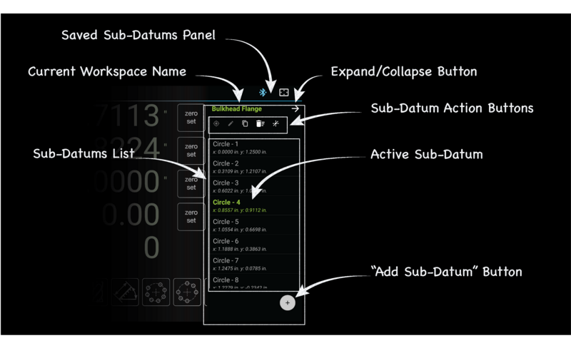
The collapsible saved sub-datum panel contains the following elements in the expanded state:
- Current workspace name
- Collapse/expand toggle button
- Sub-datum action buttons
- List of saved sub-datums in the given workspace
- “Add sub-datum” button
In a collapsed state, only the collapse/expand button and "Add Sub-Datum" buttons are visible and active.
Function Strip

The function strip appears right below the Axis Readout Display and contains a set of buttons that activate machine-specific global DRO functions:
- "Zero Set" sets all displayed axis outputs to 0; long-pressing sets the absolute origin
- The "Absolute/Incremental" toggle button toggles all displayed axes between absolute and incremental modes
- The "Inch/mm" button toggles all linear axes between inches and millimeters
- The “Radius/Diameter” button (visible if machine type is set to "Late" in application settings) toggles X output between direct reading and diameter reading
- A number of other function buttons can be displayed, depending on the application settings
Graphical View Display
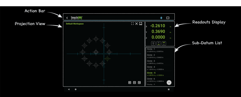
The Graphical View Activity displays a 2-dimensional graphical representation of the current workspace. Its goal is to simplify working with saved sub-datums when performing repetitive operations.
The view consists of three areas:
Projection View
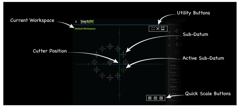
The Projection View displays a live 2D projection of the current workspace onto either YZ or XZ plane (depending on the selected machine type). Most of the view's area is taken up by the Sub-Datum locations and the crosshairs that represent the current spindle or cutter position. Additionally, around the view's periphery, there are several icon buttons for quickly setting display scale and toggling virus display functions.
Digital Readouts
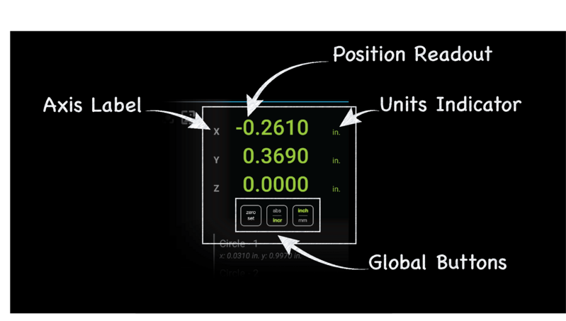
Digital Readouts Display takes up the top half of the right panel. It includes position readouts for the three linear axes, global "Zero Set" button, Units toggle button, and Absolute/Incremental mode toggle button.
The readout text is clickable and has two functions:
- Short click brings the "Preset Dimension" dialog
- Long press brings up "Axis Details" dialog
The buttons behave similarly to the main DRO display.
Sub-Datum List
Below the Digital Readouts display is the compact version of the Saved Sub-Datum list, similar to the one shown on the main DRO display. The only difference is the lack of Sub-Datum Action Buttons.
Application Settings Activity
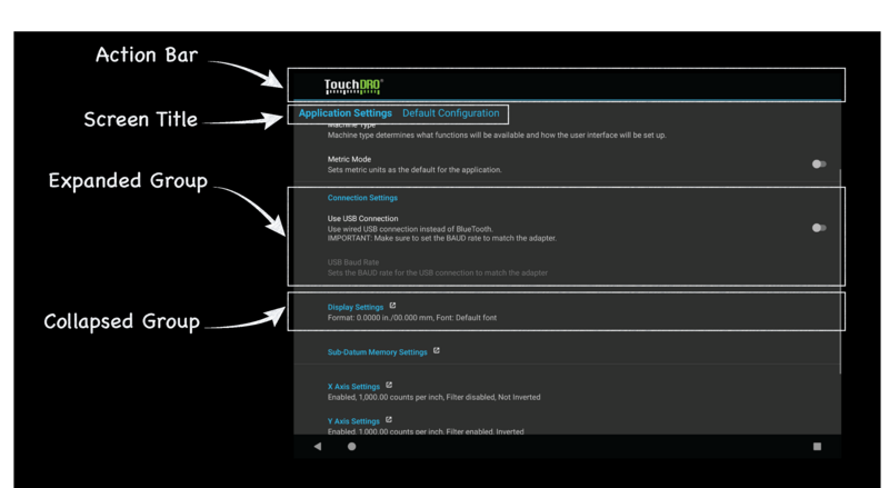
Many aspects of TouchDRO can be configured using the Application Settings Activity that can be accessed from the Application Menu.
The activity screen consists of a scrollable list that contains settings organized into groups. To make the list more concise, some setting groups are collapsed. The titles of such groups are links that can be clicked to bring up a Settings Subscreen.
Screen Title
The Screen Title appears right under the application Action Bar. Its contents change depending on the currently selected settings group:
- On the main screen, in addition to the "Application Settings" title, it displays the name of the currently selected Configuration.
- When a group is expanded, the title displays the group name and, if applicable, might include one or more action buttons.
Settings Group
As mentioned earlier, the settings are organized into logical groups. An expanded group includes a group title and one or more individual settings.
TouchDRO uses three main types of settings:
- "List" settings allow selecting a value from a predefined list
- "Text Entry" settings allow direct entry of text
- "Toggle" settings allow to switch between "on" and "off" states
Clicking on a setting row will either bring up a relevant dialog or toggle the selector switch. Please note, there is no need to explicitly save the changes - as you make the changes, they are applied immediately.
Collapsed Settings Group
Collapsed setting groups can be distinguished by the fact that they don't display individual settings and have a small icon to the right of the group title. Furthermore, some of the current values are displayed as a short summary under the group title.
Clicking anywhere on the collapsed group row opens a new settings sub-screen that looks very similar to the main settings screen and contains the same type of elements.
